
Why Amazon charts beat yours
While your competition is drawing kindergarten line charts, Amazon sees patterns that predict the future.

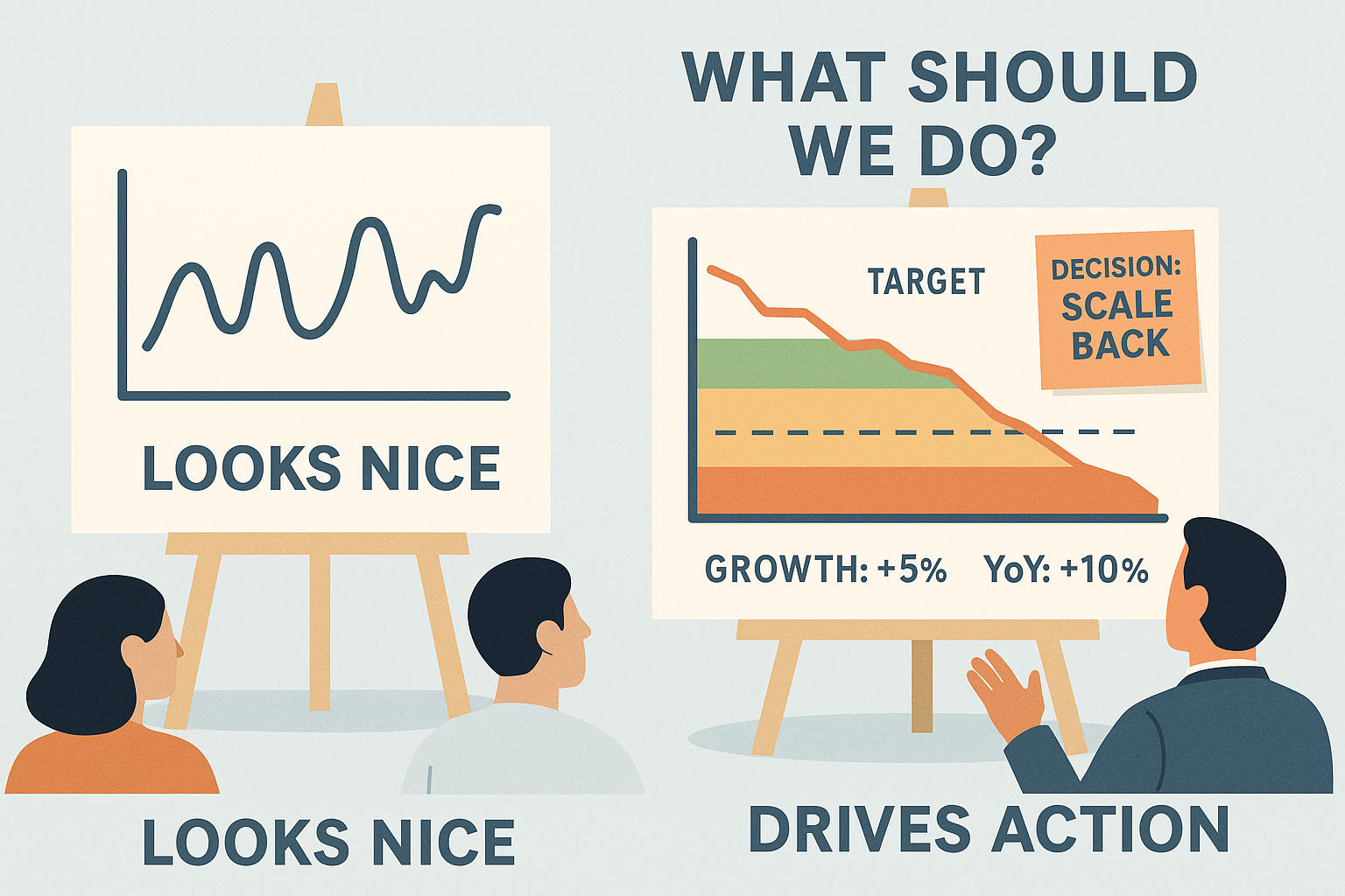
Most business charts show one metric wiggling over time. Revenue this month. Users last quarter. It's like driving by only watching the speedometer—you're getting data, but missing everything that matters for navigation.
Amazon's Weekly Business Review charts work differently. Every chart answers five questions simultaneously: What's happening? Compared to what? Is this good or bad? What's the trend? What should we do?
This isn't about prettier graphs. Amazon became a trillion-dollar company by seeing patterns others miss entirely, and acting on them. And that hardcore focus is built into every single chart. Here’s how.
If you only have 5 minutes: here are the key points
Amazon’s WBR charts are diagnostic tools, not just reports—they answer five key questions to drive decisions.
Combine multiple timeframes (e.g., weekly and monthly) on the same chart to see both short-term noise and long-term patterns.
Always include Year-over-Year (YoY) comparisons to uncover seasonal trends and avoid misleading short-term interpretations.
Integrate key metrics (actual, target, variance) directly into visuals to reduce ambiguity and drive quick decisions.
Show growth rates alongside absolute numbers to catch deceleration before it’s visible in revenue trends.
Make goals visually dominant so underperformance stands out and calls for action.
Use these five principles to transform your dashboards into decision-driving tools—Amazon's secret isn't better data, it's better data framing.
The five Amazon principles
Bill Carr and Colin Bryar, two long-time high-level Amazon executives that helped to create the WBR process share a couple of important practices in their highly recommended book “Working Backwards.” Here’s my take on them:
1. Layer multiple time horizons on the same chart
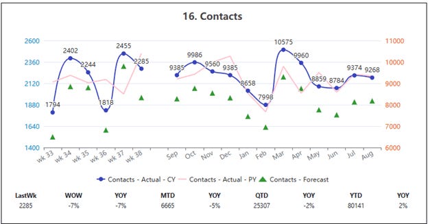
Amazon's famous "6-12 chart" displays two time periods on a single visualization: 6 weeks of recent performance with weekly intervals to highlight short-term trends, and 12 months compressed to monthly intervals for long-term perspective. The key insight isn't visual—it's analytical.
Look and learn: On the left, the weekly fluctuations look alarming, on the right, we’re seeing an August that looks a lot like July. Potential short term noise identified.
Why this reveals hidden patterns: This combination allows teams to connect short-term results with broader patterns quickly. A 20% spike this week looks alarming until the 12-month view shows it happens every December—and this year's spike is actually smaller than last year's.
The implementation decision that matters: Different Y-axis scale for both timeframes. Using same scales hides the real relationships between short and long-term performance. The key is to enable viewing side by side. Like it is “one chart.”
Common mistake to avoid: Don't just add a moving average line. That's still single-horizon thinking. You need discrete weekly data points alongside monthly aggregations to see both immediate problems (weekly spikes) and systemic issues (monthly trends).
Your implementation: Plot your most important metric with both daily/weekly granularity for recent periods and monthly granularity for historical context. The daily data reveals operational issues; the monthly data reveals whether those issues represent real trends or just noise.
2. Always plot Year-over-Year comparisons
Year-over-Year charts compare data from one period to the prior one, widely used in discussing economic or financial data. Amazon makes this standard practice, not optional analysis.
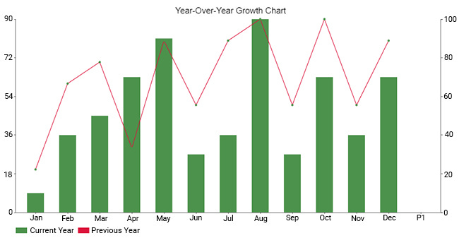
Look and learn: May and August seem to have been strong in growth this year, until we see that the previous year was just as good, and overall way stronger in growth. Compare to see trends (a decreasing growth rate in this case).
Why this separates signal from noise: Comparing specific months or quarters can smooth out periods of abysmal performance, which is crucial for effective data storytelling. That 15% revenue increase looks impressive until you see the same period last year had a 25% increase.
The analytical advantage: By comparing the same periods year-over-year, you can account for seasonal variations in your business. This prevents false conclusions about performance that are actually just calendar effects.
Implementation approach: Combo charts (like seen above) are great for illustrating year-over-year growth. They show trends over multiple years, making it easy to identify patterns and growth rates. Layer current year performance over last year's data using the same scale and timeframe alignment.
Your implementation: Add the same period from last year to every important chart. If you're tracking Q3 performance, show Q3 from the previous year. If your current line isn't consistently above last year's line, you're not growing—you're following patterns.
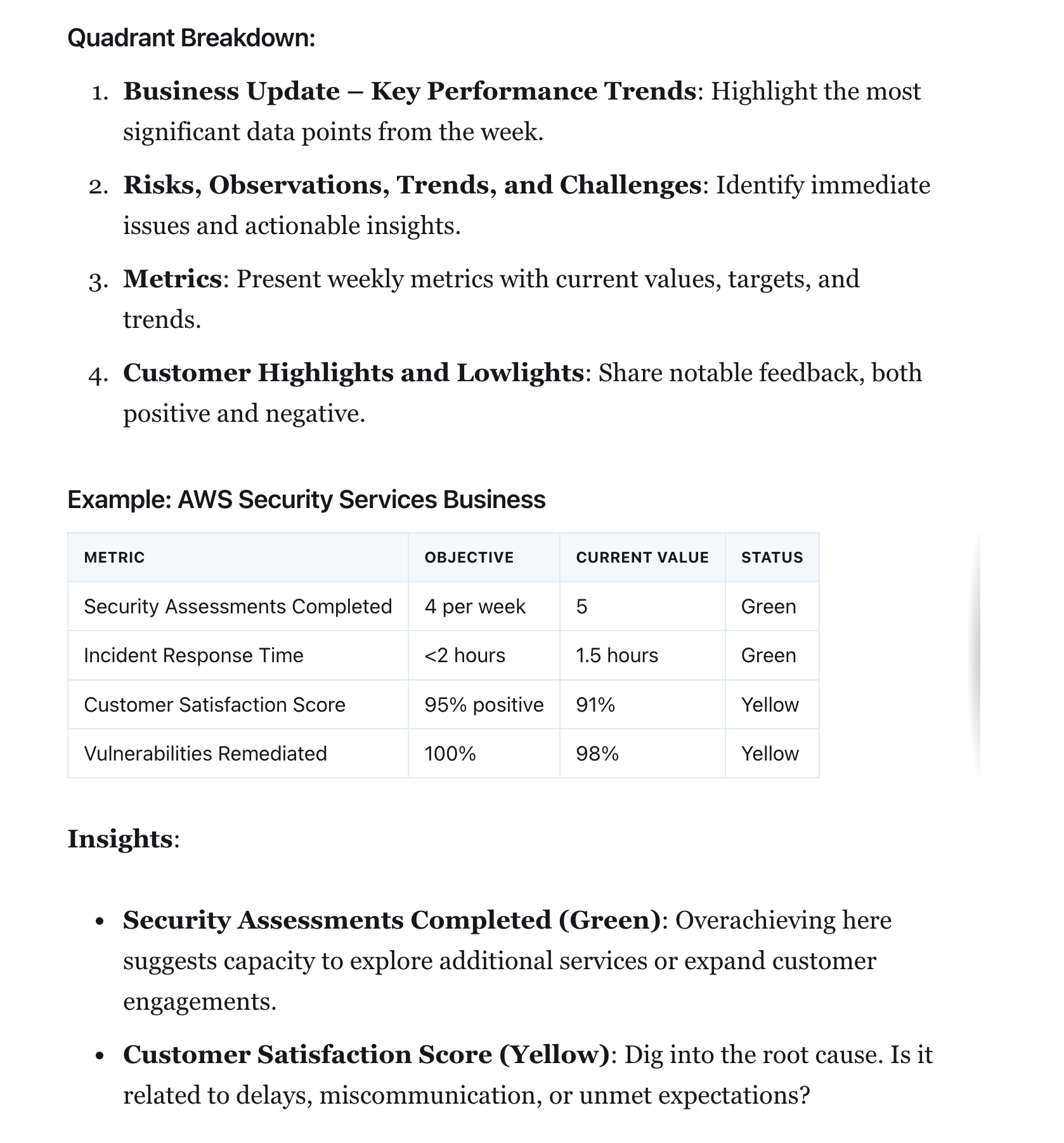
3. Embed decision-driving numbers directly in charts
Include the average or previous highs and lows. If you're working towards a goal, include the target as well as your current progress. Amazon doesn't separate insights from visualization—they're integrated.
Look and learn: Think of any “progress bar” and now imagine an “infinite progress bar without a clear end” doesn’t feel like fun, does it? You should be able to tell at what point you still should make the decision to abort something.
Why this accelerates decisions: KPIs on your dashboard can distract users and cause "information overload," making it hard to focus on insights. To avoid these pitfalls, it's important to identify the right set of KPIs to guide users to the information they need. The three numbers that matter most should be impossible to miss.
The right three numbers: Actual performance, goal/target, and variance from goal. These answer "How are we doing?" "Where should we be?" and "What's the gap?" without requiring mental math.
Your implementation: Pick the three numbers your team always asks when they see your chart. Build them directly into the visual. If someone can look at your chart and still ask "But what's our target?" you've failed.
Real-world application: I’m tracking how many insights, ideas and experiments we generate at MAIA every single week. But of course, when I first presented them everyone asked “so is that good or bad?” Now, right next to them, inside the same chart, sits the goal, what we expect to be a good performance for the number of average new ideas generated each week (a moving average to be precise).
4. Show growth rates alongside absolute numbers
Growth rate is usually measured with a monthly period, commonly referred to as month over month growth. Amazon displays these as secondary visualisations because absolute numbers can hide deceleration.
Why growth rates predict problems: Your revenue might be growing from $100M to $110M (looks good), but if last quarter's growth was $90M to $105M, you're actually decelerating despite the absolute growth. Growth rate measured in this way helps you understand your overall success better than absolute numbers alone.
The analytical insight: A line chart allows you to plot new customer growth rate or net growth rate over time. This can be a quick way to see if your MoM growth rate is holding steady, increasing, or decreasing. Declining growth rates signal problems before they show up in absolute numbers.
Implementation pattern: Line charts are the most suitable for showing trends over time. They clearly demonstrate changes and trends over a continuous period. Use a secondary chart or overlay showing growth percentage vs. the same period last year.
Another simple implementation is using two simple numbers next to your chart: MoM growth and MoM growth last month.
Your implementation: Calculate your metric's growth rate compared to the same period last year. If those growth rates are decreasing quarter-over-quarter, you have a deceleration problem even if your absolute numbers are rising.
5. Make goals visually dominant
You can also add warnings for when a metric is above or below a certain threshold to make it easier to spot problems. Amazon makes underperformance impossible to ignore by integrating targets as prominent visual elements.
Why visual hierarchy matters for decisions: The 2x2 matrix employed in Amazon's WBR mechanism offers a clear framework for synthesizing data. It keeps discussions focused on operational performance. Goals should be the most prominent element because they determine whether action is needed.
Implementation that drives action: Show data in the order of importance, so users won't miss what matters most. Goals (= objectives) aren't decorative—they're the primary decision trigger. If you're below goal, that should be the dominant visual signal.
The psychological element: Your dashboard should be able to answer your most frequently asked business questions at a glance... try to follow the five-second rule — this is the amount of time you or the relevant stakeholder should need to find the information you're looking for. Performance gaps need to be obvious within seconds.
Your implementation: Add your goal as the most visually prominent element on your chart. Use distinct visual treatment (thicker lines, contrasting colors, shaded zones) that makes the gap between actual and target impossible to miss. Use warning words like a “Status Yellow” to make it easier for others to understand where things are at.
Your Monday Action Plan
Pick your single most important business metric. Apply all five principles:
Layer time horizons: Add both recent granular data and longer-term context on the same chart
Include year-over-year: Show the same period from last year for seasonal context
Embed decision numbers: Build actual vs. target vs. variance directly into the visual
Add growth rates: Show percentage change alongside absolute performance
Emphasize goals: Make your targets the most prominent visual element
The objective of a dashboard is to provide visibility into and accountablity for the key metrics that drive the business. These five principles transform charts from "interesting information" into "actionable intelligence."
You'll be shocked how much insight emerges from the same underlying data. More importantly, you'll start seeing problems and patterns that were completely invisible in your old charts.
Amazon didn't stumble into success. They built systems to see what others miss. Now you can too.