
Thoughtful Friday #11; Designing Great Data Apps


I’m Sven, and this is Thoughtful Friday. The email that helps you understand and shape the one thing that will power the future: data. I’m also writing a book about the data mesh part of that.
But unlike the Thursday mails, this is a deep dive into one of my thoughts. It’s rough and my perspective on this will likely change. So for you, I think you should deeply think about this topic this week:
Why your data app probably sucks
How the Twitter search is great at hiding complexity
How to build an iPhone, not a Blackberry-like dashboard
🔮🔮🔮🔮🔮🔮🔮🔮🔮🔮🔮🔮🔮🔮🔮🔮🔮
I just reread Don Norman’s book “The Design of Everyday Things”. Dashboards, Reports, Recommendation Engines, are becoming our everyday things! Or how many people do you know that cannot tell you from the top of their head at least 2 recommendation-like thingies (Thanks Amazon & Netflix)?
Great design is important in all solutions and applications. But it is especially important in the ones that tend to be more complex, and that for some (not good, not apparent) reason do not hide this complexity. Data applications of all kinds fall into that category, I see that when I look at dashboards, recommendation engines, data catalogs, infrastructure, and almost every single product of a company in the data space.
What’s hidden or well-packaged complexity?
Twitters Search is amazingly complex. It’s not just about searching, you might want to search for people, hashtags, tweets, and yet, Twitter hides all that complexity and provides you with an amazing search experience:

In fact, Twitter offers at least four layers of hidden complexity.
Layer 0: Your quick search bar on the top right, is easy.
Layer 1: The picture above you get when you click on “search results” and not on one of the quick results.
Layer 2: The filter options you have right here are already set and deliver a decent result base.
Layer 3: You can use the advanced search from here e.g. filtering for tweets by a certain person.
Layer 4: Finally, if you want to go really fancy, you can use the Twitter Search API.
And yet, 95% of the time, I use the quick search bar. Until today, I didn’t even know how to go to - Layer 3.
Ok, so let’s make this tangible and walk through the process say for a set of dashboards. I like to make things real. Here is my process for designing amazing dashboards, which includes hiding complexity.
The caveat about a lot of data applications is that before you can hide complexity, you’ll need to:
1. Design a proper product
2. Make the complexity transparent
Step 1. Figure out what people would like to “see”
This is the easiest step of the process, which involves talking to people, thinking through the problem yourself, brainstorming etc.. In the end, you’ll have a long list of things.
Step 2. Figure out “Why”
Yes, I think it’s “figuring out” not “asking people”. The idea of designing good products is always a balance between talking to people and asking what they need, then understanding the underlying reasons, and potentially delivering something different which still solves some of the problems and maybe more.
This step is really about understanding the domains of the people using the dashboard, the decisions they have to make, and their process for implementing these decisions into action.
Step 3. Figure out the Data
Next, you’ll need to figure out which information is needed, and which is not needed.
Never display too much, just the right amount of information.
Step 4. Does this generalize to more users?
Make sure you have a proper userbase for your data app/dashboard. Add filters, enlargen it to a set of dashboards, maybe even deliver something that doesn’t serve the original “request” or “idea”. That’s what good product management is about.
Step 5. Figure out an appropriate medium
Not all dashboards deserve to be dashboards. Some should be notebooks, some machine learning systems, some reports, some CSV dumps. Make sure you understand the process of the people using it. If the customer support needs a report to display the top bought items to then call customers, maybe you can go straight for a recommendation engine instead.
Step 6. Design a great user experience
The mantra here is simple: Build the iPhone, not a Blackberry.

One button vs many, with a bunch of extra keys, courtesy of iMore.
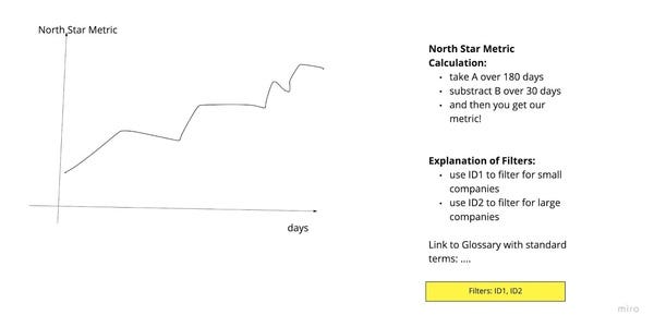
Good dashboards don’t need additional paper documentation. They have the documentation inside the dashboard. Here’s my terrible example of one “North Star Metric” dashboard which has the relevant information right on the dashboard. I’d assume you would be able to use and understand it without any further information.
But we’re not gonna stop at good.
Great dashboards don’t need documentation. They are self-explaining. The easiest way of doing that is to expose your business logic to graphical implementations of it. This essentially means you’re making complexity transparent. A nice side effect is that this makes the dashboard way easier to debug should problems occur. Even a user could now debug numbers on certain days without help from a data engineer.
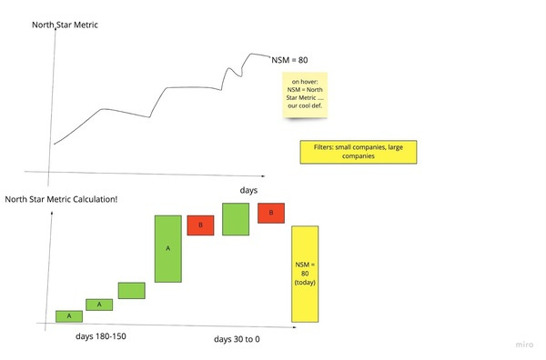
You might think that’s too complex to display! But you know what, if you do not display the calculation in this example, you’re effectively assuming every user of this dashboard is doing that in his head.
From my perspective, that is even worse. What you’re aiming for here, is making complexity transparent, or to say it in different words, to “stop aggregating away complexity”.
Amazing dashboards have another feature, they are the true iPhone because they simply do not have that complexity! Once you are able to make the complexity visible, you might also be able to help a process to reduce it, design a north star metric that is easy to understand, which actually carries true meaning in itself.
Amazing dashboards are like the Twitter search. They have only plain and simple concepts on the big dashboard which 95% of the people use 95% of the time. And then they have layers and layers.
Keep this example in mind, the Twitter search and the dashboard. Now think about your data products, are they good a hiding complexity? How about the dashboards you use every day? I know a bunch of the things I built suck from that perspective.
And of course, leave feedback if you have a strong opinion about the newsletter! So?
It is terrible | It’s pretty bad | average newsletter… | good content… | I love it, will forward!
Data; Business Intelligence; Machine Learning, Artificial Intelligence; Everything about what powers our future.
In order to unsubscribe, click here.
If you were forwarded this newsletter and you like it, you can subscribe here.
Powered by Revue