
The one metric evolution that changed how 700 people make decisions
The hard way to find the right metric (and why it worked).

When I first arrived at Unite (as PM in 2019), I sat through 6-hour meetings with 15 people that started with brainstorming sessions. When I left, every meeting began with deep metric reviews from the data platform I managed.
Between those two moments: 3 years of trial and error, lots of pain, and a north star metric that evolved from
50 Weekly Active Users
to Monthly Active Users
to Category MAUs
to Gap-to-Benchmark.
Each evolution was forced by crisis, not analysis.
This wasn’t casual optimization. At a 700-person inflection point, my career and the company’s competitive edge both depended on getting this right.
McKinsey and every consulting firm that followed created elaborate “metrics frameworks” with KPIs across six business dimensions. Great for billable hours, terrible for actual decision-making.
Here’s what actually happens when the stakes are real.
If you only have 5 minutes: here are the key points
Start simple, evolve by necessity: The most effective north star metrics are forged through real pressure—not theoretical planning.
Crisis fuels clarity: Each shift in your metric should reflect a painful truth about user behavior, organizational inertia, or strategic misalignment.
WAUs → MAUs → Category MAUs → Gap-to-Benchmark: The evolution shown here isn’t about adding complexity, but aligning measurement with impact.
Beware of vanity metrics and fake victories: Metrics that plateau or look good on paper can lull teams into complacency.
One metric, many iterations: Instead of tracking 10 KPIs, evolve a single, meaningful metric to focus organizational energy and drive change.
Qualitative + Quantitative wins: Pairing numbers with stories unlocked momentum and helped reshape how decisions were made.
The make-or-break setup
Managing a data platform for 700 employees sounds straightforward until you’re standing in biweekly demo days explaining why your numbers aren’t moving.
50 Weekly Active Users out of 700 employees. This was my one big project, handed to me by the CEOs and CIO. In an organization built on founder instincts and departmental leaders who could think through complex problems on their feet, I had to prove data infrastructure was worth hundreds of thousands in investment.
The pressure was relentless. Demo days every two weeks. Quarterly planning sessions where progress got scrutinized. Executive check-ins asking pointed questions about resource allocation.
Six weeks in, I realized we had the wrong metric. But changing your north star metric feels like admitting failure when everyone’s watching.
Crisis #1: When “success” means you’re fired
Six weeks of building new data projects in critical business areas. Serious developer resources, new integrations, key stakeholder buy-in. I walked into demo day confident the numbers would finally reflect our value.
WAUs: still 50.
The response was swift: “Is that good or bad? Looks okay to me. I don’t want to use those BI tools anyway—this looks great! I think you’ve achieved your goal. Go work on something else.”
Translation: We’re about to kill your project.
The agonizing realization: We were measuring imaginary behavior. Key decision-makers weren’t logging into dashboards weekly. They had quarterly reviews, monthly board meetings, strategic deep-dives every other week.
We were measuring our fantasy of how people should use data, not their reality of how they actually do.
Evolution forced by crisis: WAU → MAU. Finally, numbers started moving.
Crisis #2: When progress becomes the enemy
Monthly Active Users were growing, we managed to provide a good platform for more and more of the key decision makers. Team morale improved. I felt like we’d found solid ground.
New crisis: We hit a plateau. We managed to grow and get more people on board with using data, but then we hit several departments where the executives simply had established workflows, and wouldn’t “start to use your stupid platform now.”
These executives already had established workflows. How do you drive “more engagement” among people who don’t want to be engaged with dashboards and data sets?
The real goal changed from getting more people to check data monthly. It was iterating to people becoming more data-driven across multiple business areas, not just their departmental silos.
But MAU treated someone using one data source the same as someone using five different reports for comprehensive business decisions.
Evolution forced by desperation: Category MAUs. Count people across multiple data assets. Someone using both sales dashboards and customer analytics counted twice because they were exhibiting the behavior we actually wanted.
We saw this in meetings too. Even if one exec didn’t use our data, another would, because it contained cross-departemental data, and thus also provide data to the other execs.
Numbers went up. Engagement spread. We could finally see which parts of the organization were truly embracing data-driven decision-making.
Crisis #3: The victory trap
Category MAUs growing steadily. Month-over-month improvements. The team was hitting targets.
Stakeholder reaction in review meetings: “We already feel quite data-driven, let’s talk about other things.”
The metric was working too well. Upward trend became permission to declare victory when we knew we weren’t anywhere near where we needed to be.
This is how internal projects die: not from failure, but from mediocre success that gives stakeholders an excuse to stop pushing.
I went into personal crisis mode again. Maybe they are right? Turns out they weren’t. I found a better metric to capture what we as a company wanted to achieve.
Evolution forced by survival instinct: Our metric wasn’t Category MAUs—it was our GAP to industry benchmark (per Category MAU).
Suddenly we weren’t celebrating incremental progress. We were behind industry standards, and the gap was significant and undeniable.
That gap metric gave us permission to expand scope: workshops, data catalogs, enablement resources. We weren’t just maintaining a platform anymore; we were systematically closing a competitive gap.
The number that changed things
Final evolution: One gap metric plus stories and qualitative insights.
The combination created narrative momentum that fundamentally altered how a 700-person organization operated.
Those 6-hour brainstorming meetings became data-driven decision sessions. Every discussion started with metric reviews. Teams came prepared with data, not just opinions.
The data platform didn’t just get adopted—it changed the company’s decision-making DNA.
One metric that evolved four times over three years. Each evolution forced by crisis, not strategy. Each change revealed gaps in our thinking about what “data-driven” actually means under pressure.
Sounds like crazy hard work? It was. Like all hard things. Progress isn’t free. The final metric isn’t a simple “fun” metric. It’s one we could influence with specific measures. It’s one that carried meaning. And it’s one that was easy to analyze, to derive further actions.
Why most teams drown
Every evolution point had a “more metrics” temptation. When WAUs weren’t working, we could have added engagement depth, session duration, feature usage. When Category MAUs felt actionless, we could have built individual dashboards for each business area.
Teams drown when they add metrics instead of evolving them. More comprehensive dashboards don’t make you data-driven—they make you data-paralyzed when the pressure is on.
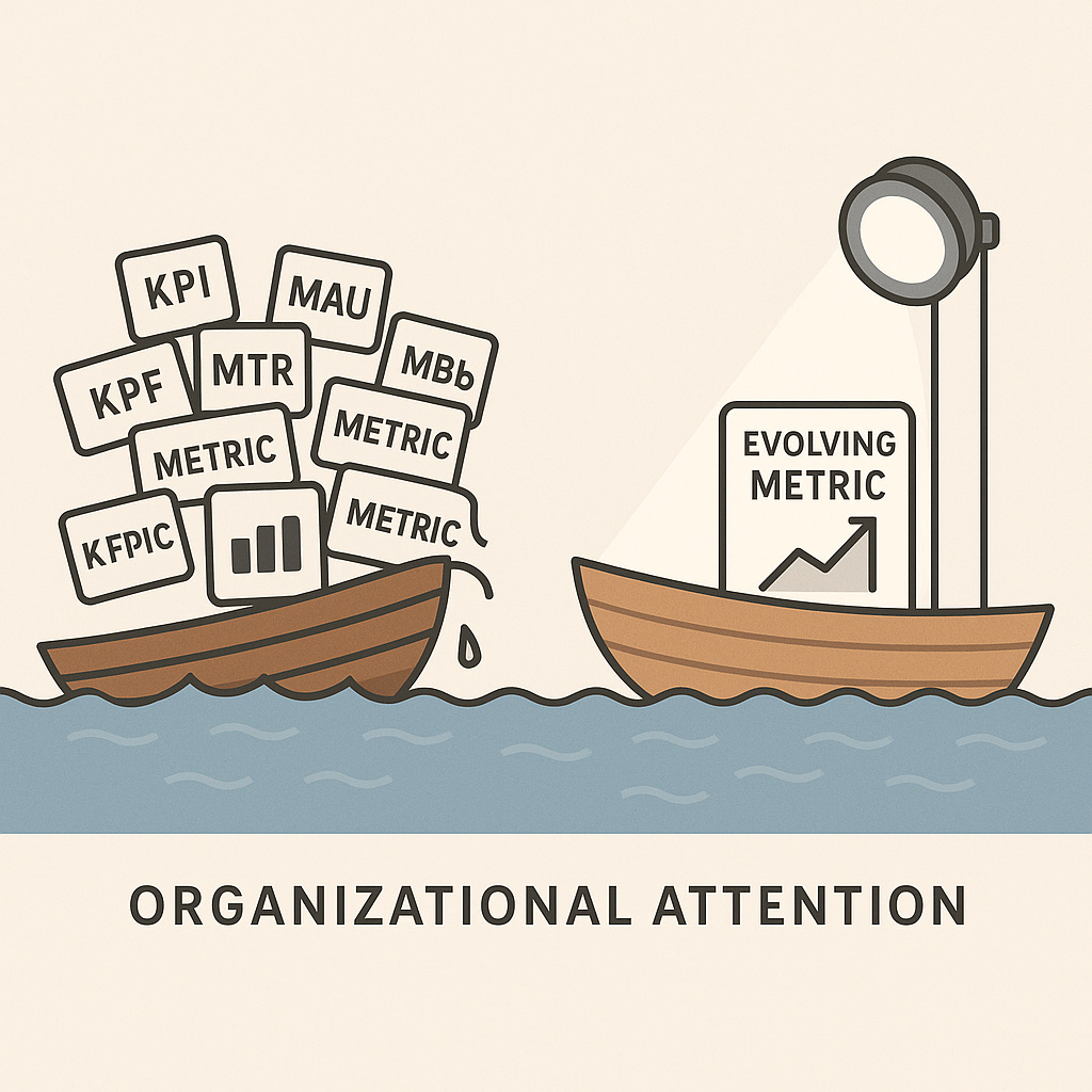
The math is brutal: five metrics get 20% of organizational attention each. One evolving metric gets 100% attention and breakthrough results.
The organizations that survive high-stakes transformation iterate on one metric instead of multiplying ten.