
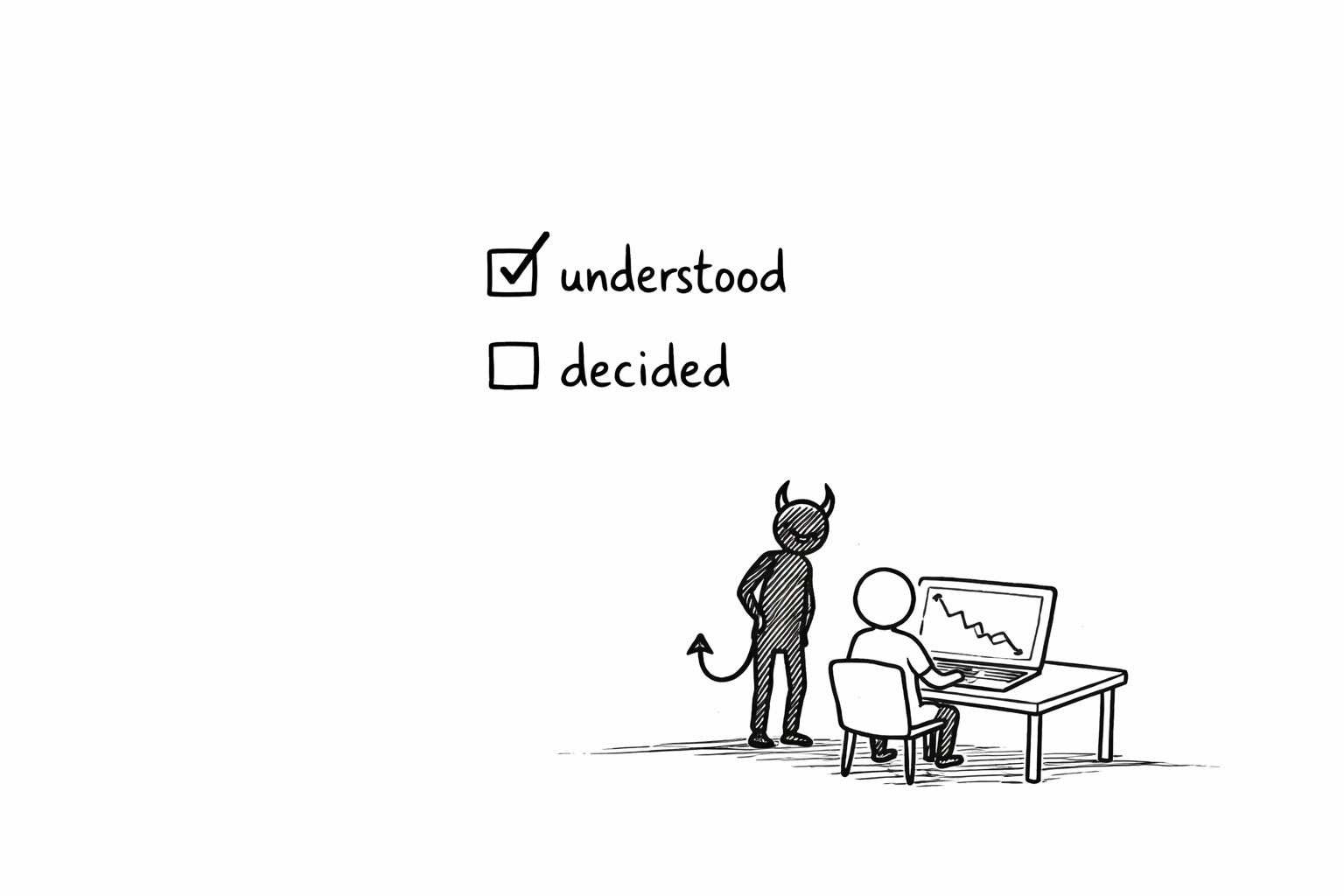
Dashboards are easy to read. That’s the problem.
A 5-question scorecard for dashboards, decks, and charts—and the three harder formats that turn “understood” into “decided.”

“Hey Sven, we’ll think about this, but we need to figure out some more important things first. We’ll get back to you in six months.”
I’d spent a week on that presentation. Real revenue numbers from ML initiatives we’d already shipped — millions, not projections. Clean slides. Sharp charts. Three senior executives in the room. They liked the numbers. They nodded in all the right places.
And then, six months of nothing. For millions in proven revenue (in theory).
I didn’t have a data problem. I had a format problem. I just couldn’t see it because the format was designed to be invisible. My slides were optimized for ease — glanceable, clean, professional. And that’s exactly why three executives could consume them, feel like they understood, and move on without deciding anything.
SIDENOTE: Kahneman called this WYSIATI — What You See Is All There Is. Your brain checks “understood” and stops thinking. It’s a neat concept and I think it explains a lot about why dashboards and slide decks feel productive but aren’t.
The format made consuming feel like deciding. It wasn’t. And I think I can now count exactly why.
The five-question scorecard
Before you ship your next data output — dashboard, deck, email with a chart, whatever it is — ask these five questions. The answer to all of them should be yes. For most dashboards, the answer to all of them is no.
Does it force a story? Not metrics floating in space — a beginning, a middle, a “so what,” a recommended action.
Did the person who created it have to struggle? Not technically — intellectually. Did the format force the producer to actually think through the meaning, not just pull numbers?
Does it take real effort to consume? Not a 10-second glance. Minutes of focused reading or study from the person receiving it.
Can you point at any number in it and name exactly who to call? Not “the data team.” A specific person who owns that number and its interpretation. If the answer is “I don’t know” — that’s a clear No.
Is there a built-in process for others to challenge the reasoning? Not polite nodding. Actual scrutiny, expected and structured.
Score 0–5. That score predicts whether anyone acts on it.
My slides that day? 0/5. The session that actually got me the budget — a whiteboard, a marker, and 60 minutes of live reasoning? 5/5. Same person, same data, different format, completely different outcome.
For me, this isn’t a dashboard problem. It’s a format problem. Dashboards are just where you feel it first. Let’s walk through why each of those questions matters — and what to do about it.
1. Why these five properties force decisions
ach question maps to a property that catches a specific way your brain fakes understanding. Miss one, and that failure mode gets a free pass. Let me walk through them.
Narrative structure forces the reconstruction of causality. You literally cannot write “show me revenue by region” as a coherent narrative without confronting the question you haven’t asked: “what decision does this support?” Without narrative, the consumer never connects the number to a real-world action. The data just sits there, looking important.
Creator friction means the person producing the output had to do real interpretive work — not just technical work. Pulling a dashboard view takes 30 seconds and zero thinking about what it means. Writing a narrative analysis of the same data forces the analyst to confront gaps, weigh tradeoffs, and commit to an interpretation before anyone else sees it. The difficulty is the filter: if the format didn’t force the producer to think, the producer didn’t think.
SIDENOTE: And here’s a distinction I think is really important — a junior analyst spending 40 hours building a dashboard is high effort for the wrong kind of work. That’s builder friction, not creator friction. Builder friction means you worked hard on layout and SQL. Creator friction means you worked hard on meaning. Those are very different things.
Recipient friction means the decision-maker has to struggle to consume it. A dashboard is designed to be glanced at. A dense memo takes 20 minutes. That’s the point. When consumption is easy, the executive’s brain pattern-matches on red/yellow/green and moves on without rebuilding a real-world model. Easy consumption feels efficient. But I think it’s actually the mechanism that lets data pass as “understood” without anyone actually understanding it.
Reasoning accountability means you can point at any number, any claim, any interpretation in the output and name exactly who owns it. Not “the analytics team” or “it’s in the dashboard” but a specific person who will pick up the phone and answer every question about why that number is what it is and what it means. If you point at a metric and the answer is “I don’t know who’s responsible for that” — you don’t have accountability. You have a number with no owner, and numbers with no owners drive zero decisions. I’ve seen this more than once.
Structured challenge means the format creates a pathway for others to poke holes. Not just consume — challenge. A Slack message saying “looks good” is not structured challenge. A review where attendees spend 20 minutes reading and 40 minutes in line-by-line debate is. Without it, one person’s plausible-sounding story goes untested. And plausible-sounding is not the same as accurate.
2. Score your own formats and watch them collapse
Let me just put a couple of common formats in there so you can see what I mean:
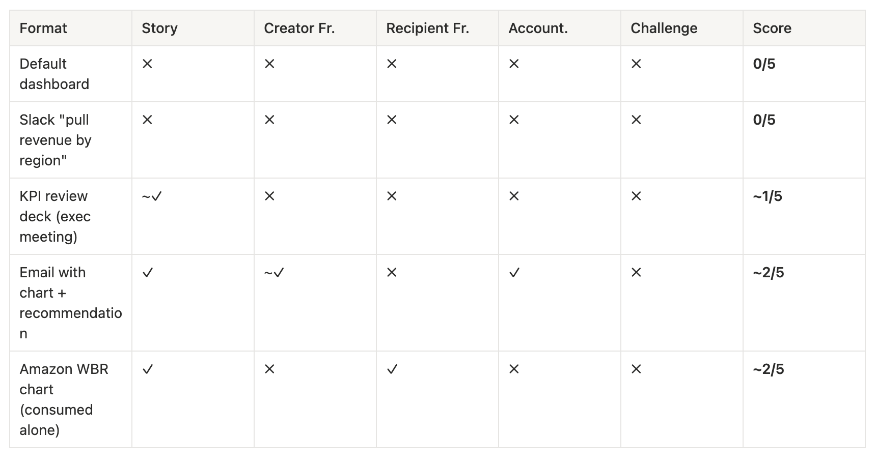
I wrote an entire piece on making dashboards suck less. The best I could do with all of that? Upgrade from 0 to about 2. Real improvement, sure — but three properties still completely untouched.
And here’s a thing I think a lot of people miss: copying the WBR chart format without the WBR meeting is why companies get 2/5 and zero decisions. The chart is not the thing that works. The system around it is.
So if the formats you use every day top out at 2 — what actually scores higher?
3. Three formats that force decisions, and how to run them
So let’s stop upgrading dashboards. Instead, choose formats that already have the properties baked in. Yes, they’re harder. That’s the point. Instead of 500 dashboards and 0 decisions, you get 10 well-formatted outputs and 8 actual decisions. That math looks terrible to a service desk. But it looks pretty great if you’re a business leader.
The written memo + structured review
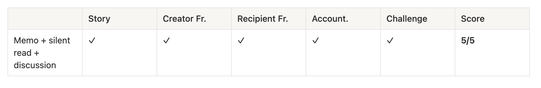
Bezos banned PowerPoint and replaced it with six-page narrative memos. Some teams write ten drafts — the format forces the producer to confront every gap in their reasoning before anyone else reads it. The meeting then starts with 20 minutes of silent reading, followed by line-by-line debate.
How to run it:
Decision question at the top: “Should we approve X?” or “Choose A vs B.” This forces narrative.
Silent read 15–20 minutes. No pre-read allowed — everyone engages fresh.
Line-by-line challenge. The author defends every claim. Every number has an owner — and it’s them.
The whiteboard session
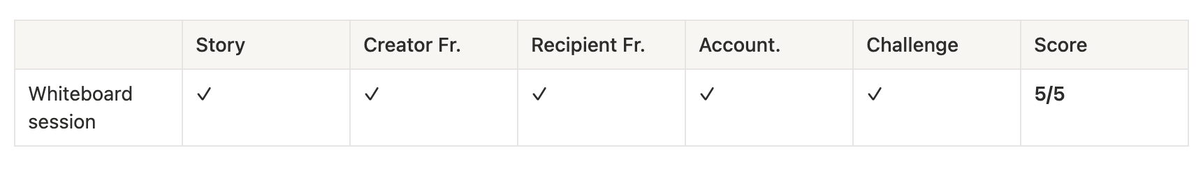
Jensen Huang near-totally banned PowerPoint at NVIDIA. His team ensures a whiteboard is available wherever he goes — one former executive recalled a whiteboard so large it took five people to move it into the room. I love that. Slides let people hide incomplete thoughts behind polished formats. A whiteboard doesn’t let you hide anything.
How to run it:
Start with the value chain or logic structure on the wall. Draw it live — no pre-made slides.
Write assumptions and numbers as you go. Sources visible. Your hand, your claims.
Force objections on the wall: “What would make this wrong?” The room challenges in real time.
The structured data review (WBR-style)
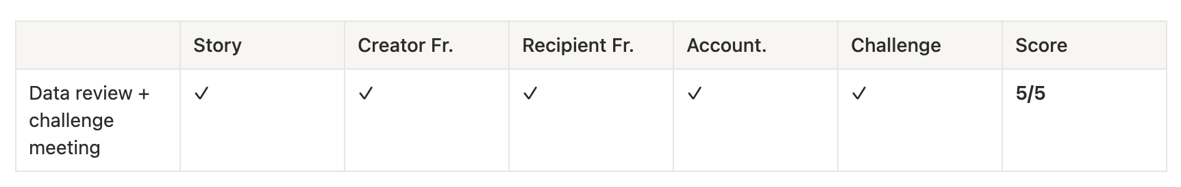
This is the only version where a dashboard-like artifact scores 5/5 — and only because the system around it forces every property. Amazon’s WBR charts are dense and deliberately hard to skim. But the chart is never consumed alone. The presenter built the interpretation and owns it by name. The meeting is a challenge protocol, not a status update.
How to run it:
Ban consuming the charts alone. Interpretation happens live, with the person who built it present.
The presenter states what the data means and owns it. Point at any number — they answer.
The room’s job is to challenge: “Why do you think that? What are you missing?”
I don’t think you can optimize decisions by optimizing ticket volume. You optimize decisions by choosing formats that force you to actually think.
You know how I personally got our top management to buy into my machine learning initiatives? Full budget for a year for a whole team?
I didn’t build a dashboard or a slide deck. I didn’t send a report.
I bought 10 meters by 2 meters of whiteboard — the adhesive kind you glue onto a wall. Got it installed. Booked 60 minutes with my exec. And I spent that hour at the wall, sketching out our value chain, walking through where ML could push the bottlenecks, running base numbers together right there on the board.
He didn’t glance at a chart and nod. He followed the logic for an hour. He questioned the numbers. He challenged assumptions. My hand was on the marker, my reasoning was on the wall, and when he pushed back I had to defend it — live, with nothing to hide behind.
That session scored 5/5. I didn’t know it at the time. I just knew it worked.
Next time someone sends you a dashboard request, don’t build it. Score it.